Following up on my previous post on content management, today I am going to share a few ideas about how to make texts, pictures, videos and other pieces of content accessible.
Navigation is the key to guide visitors from bits of content they weren’t looking for to what they are looking for and what they didn’t know they were looking for. Some examples are menus, footers and sidebars.
Less is more
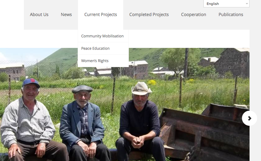
Menus are used for general guidance to the main website sections and are often placed across the top of the website.
It is important to choose consistent names for each section of the menu. This will make it easy for the visitors to glance at a page and head to the section they need.
Depending on the content and type of information, you may want to consider having a reasonable number of subcategories. It may not always be easy and you would probably want to have a specific subcategory for each piece of your content, however simplicity is the best strategy.
For example, if you have a menu section “Publications” and there are two articles, three reports, five case analysis and three “other” publications, you may want to group some of them together. In this case, the articles and reports could be set under one subsection, unless you think that you will have more publications in that category in the future.
Suggest related content
Sidebars offer an effective way to navigate viewers through the website and can direct them to relevant content.
You can have different sidebars for each section of the website, although it is also possible to create a few thematic sidebars that rotate according to the content of each page.
The right or left sides of the website can be used for posting recent news, relevant articles and perhaps tweets, pictures and videos.

Save the best for last
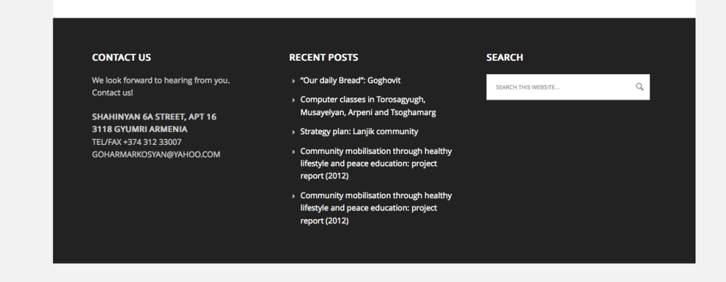
Footers are another way to guide people through the website. They are used to highlight different pieces of information. For example, you can ideally include your contact details, suggest visitors to follow you on social media or offer them the possibility of signing up for the e-newsletter.
Another advantage of footers is that here you can include the sitemap, an index of your website’s content. It can save the reader’s time when trying to locate a specific type or piece of information they are looking for.
Balanced use of different navigation techniques will make your website more user friendly and save visitors’ time and patience.
When the content of the website is well managed, you can start thinking about the design. In my upcoming post, I will discuss a few design options you may want to consider while building a website for your organisation.
Manushak is an intern at HURIDOCS from the NGO Women for Development, based in Armenia. She has joined HURIDOCS for four months as a part of the Open Society Human Rights Internship program. Manushak holds a BA in Theology from Yerevan State University and an LLM in European Law from University of Saarland in Germany.
