We’re happy to announce new features in Uwazi. Click on the links to get more details!
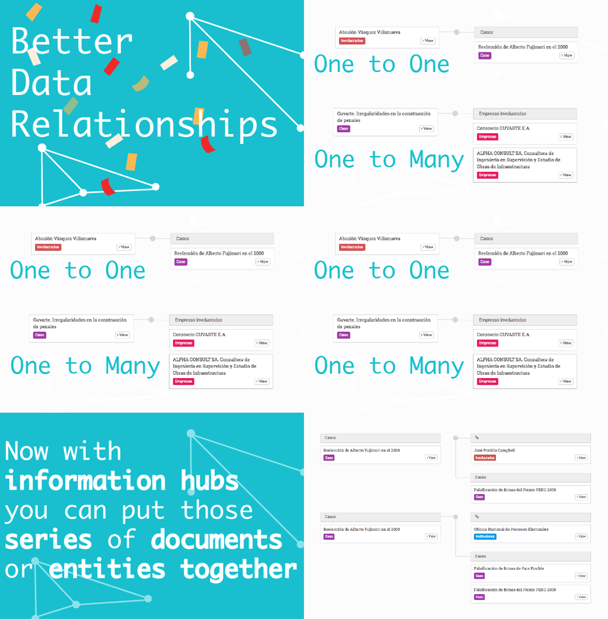
- Even better data relationships, now with a new interface, more user friendly than ever and supporting information hubs which will allow you to put series of documents or entities together.
- Make your collection private so that sensitive information is only accessible to certain users.
- Configure default filters you would like to show the users, even when no document or entity type is selected.

Improvements
- Better search: now all fields are used for full text searching.
- Improved Vimeo embeddings: users can add time links to particular parts of a video in Vimeo embeddings.
- Better use of screen real estate: Uwazi will expand to full width while in library, showing more cards per row. This way users with big screens can display more information at once.
- Card rendering has been improved: fields containing long information such as rich text properties will be limited in its height so the cards are not too big.
- The “Open document” button has improved so users have a better understanding of how to access the document instead of the metadata side panel.
Check out the bugs we fixed in this version here!
New to Uwazi?
Watch our video for a quick introduction to Uwazi and learn about how organisations are using it! To receive updates on Uwazi development, subscribe to the Uwazi newsletter.
